Connect by T-Mobile
“Digital first” is the new initiative at T-Mobile. The goal..to provide an experience that allows customers to self serve before entering T Mobile stores. I was brought on to work with on the Prepaid and Metro website which needed a UX overhaul. We immediately identified issues and pain points with the purchasing path . Marketing also launched a new brand called T Mobile Connect. A new plan tier system for purchasing 6 to 12 Month worth of data upfront. This included revisiting how users interact when browsing and purchasing devices and plans. enhancements to the account management section of the website.
Website Issues
Consistency
in some places, users were prompted to select a plan on landing pages and then prompted again on transactional pages.
Performance:
Loading time was lengthy when populating devices on area code
Resilient information architecture
Users are prompted to build their order ‘device first’ or plan first flows.
Key Behaviors that Shape the Application
Comparing Pricing
Browsing Devices
Analysing Data, Storage, Talk Text Limitations
User Insights Screen Recording
Research
The team and I put together a research plan to observe user behaviors under the then current ux prepaid paradigm.
The baseline study uncovered issues on the website that hindered purchasing plan options and overall navigation issues.
Users found that many of the nomenclature was unclear making them hesitant to select.
Janky UI
Some of the searching and filtering patterns were a bit dated for users, so we added these to the punch list of items to redesign.
UI didn’t match real-world expectations
The old UI did not anticipate users need to move down to the path from plan to device selection to purchase, it put much work on the user to search and find their own way to the next step.
Inconsistent Plan Selections
The plan selections were very unclear and did not show items added to the cart.
Mapping out Opportunities
Conducting sufficient research helped me Identify pain points in the UX to map out the scope of the project and prioritize what we needed to tackle first. I distilled some of these behaviors into personas to keep the user in mind when making recommendations surrounding the UI.

Ideations, Sketching Solutions
Heuristic Analysis
The Prepaid site previously had this page called the product selector. The UI attempted to squeeze plan, device, and service selections into one page. From our user interviews, this page was a major hurdle and needed to be replaced with a much more standard purchasing experience.
Plans hidden in accordions, users glanced over options
Unclear device selection, the links to the user are out of the flow without saving.
Unclear service names cause pogo-sticking between service and plan selection as they are related.
Plan selection flow ideation
After the flow is established I sketched the interactions from the plans page to checkout and including the account dashboard.
Even though the purchase flow from plan selection to cart was the first I had to consider how already established customers would change plans from their account dashboard.
Purchase Flow
I designed a high-level workflow to communicate the ideal design that addresses all the above issues. Instead of the one-page product selector; Users select a plan from a standard plans page, go to the cart where they can add-a-device or ‘Bring Your Own Device‘ BYOD, and proceed to checkout.
Landing Page Consistency
The site contained different plan structures that were siloed onto different pages for marketing purposes. I decided to include an All Plans page containing all plan types to address users abandoning the site because they didn’t see all options available
Design
Through constant iterations and insight gathering, I Designed the purchasing path, from Plan and device selection to checkout and collaborated with marketing on the look and feel of the design.

New Branding
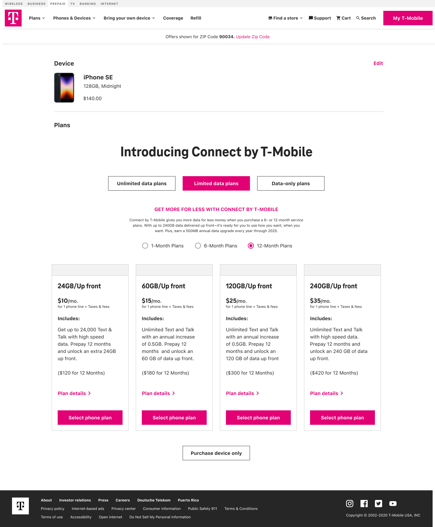
Marketing created a look and feel for the Connect by T-Mobile Brand. I collaborated on the Design from the landing page into the purchase flow to make sure it was seamless and made sense to the user. the color scheme helped to suggest these plan options have something different to offer.


The design layout encoroporates branding and new plan structure and the firs step through the purchase flow
The next step is the new cart design so users immediately know the cart has a plan but still needs a device to complete the checkout.
The new design follows a linear path from plan to cart spread out between the service page PLP and PDP pages. I designed for mobile and desktop.

Here is a change plan scenario, the device is displayed up top to show the current selection

The cart shows the device and plan selection


