SocketLabs Dashboard & StreamScore enhancementThe SocketLabs email delivery dashboard needed an update to help users solve email deliverability issues.
Needs: Make information more scalable, Incorporate a status bar of initial sign-up steps, Clearer graph for email statistics, allow users to filter ‘sent email’ by sending the domain, and Expand the tabular data to view and scroll through more information. Navigation redesign.
Strategy:
Update the look and feel to use in Product Marketing Material
Create a one-stop shop to see my entire email deliverability status.
Provide opportunities for users to drill down and solve deliverability problems ie: failed delivery, wrong emails etc.
Guiding Principles:
Scannable
Past, Current and Future stats
Personas
I worked with Mmarketing support, and sales, to uncover some users that are interested in the product subject matter experts and first-hand interviews we discovered 2 main personas to work with;
System Admins: Understands email delivery from a technical standpoint. Works on the infrastructure team for companies that send mostly using Socketlabs platform when there is a problem
Email Expert : Understands email delivery from a marketing and content perspective and checks email delivery stats routinely.
“Whatever it is, the way you tell your story online can make all the difference.”
— Quote Source
Email Deliverability and the SocketLabs have some complex components, I created a Conceptual Map to help grasp the information and how everything connects. This helps to prioritize what would need to be displayed on the Dashboard and StreamScore
To help position the product, I conducted a Comp Analysis looking at the top competitors. The opportunity was in providing a 1000-foot view of email performance and email notices about email engagement. the idea is to remind users about email performance changes before they run into problems.
Mapping out the user story helps to scope the project relative to the User Experience.
The behaviors are in blue and potential features are in yellow.
Not everything will make it into the sprint but this gives us a good direction to go in.
Scenario: Customers are alerted about a change in their email delivery via the email score,
Login and observe that change.
under each step i list a feature that can help with the user behavior
Ideation Sketches
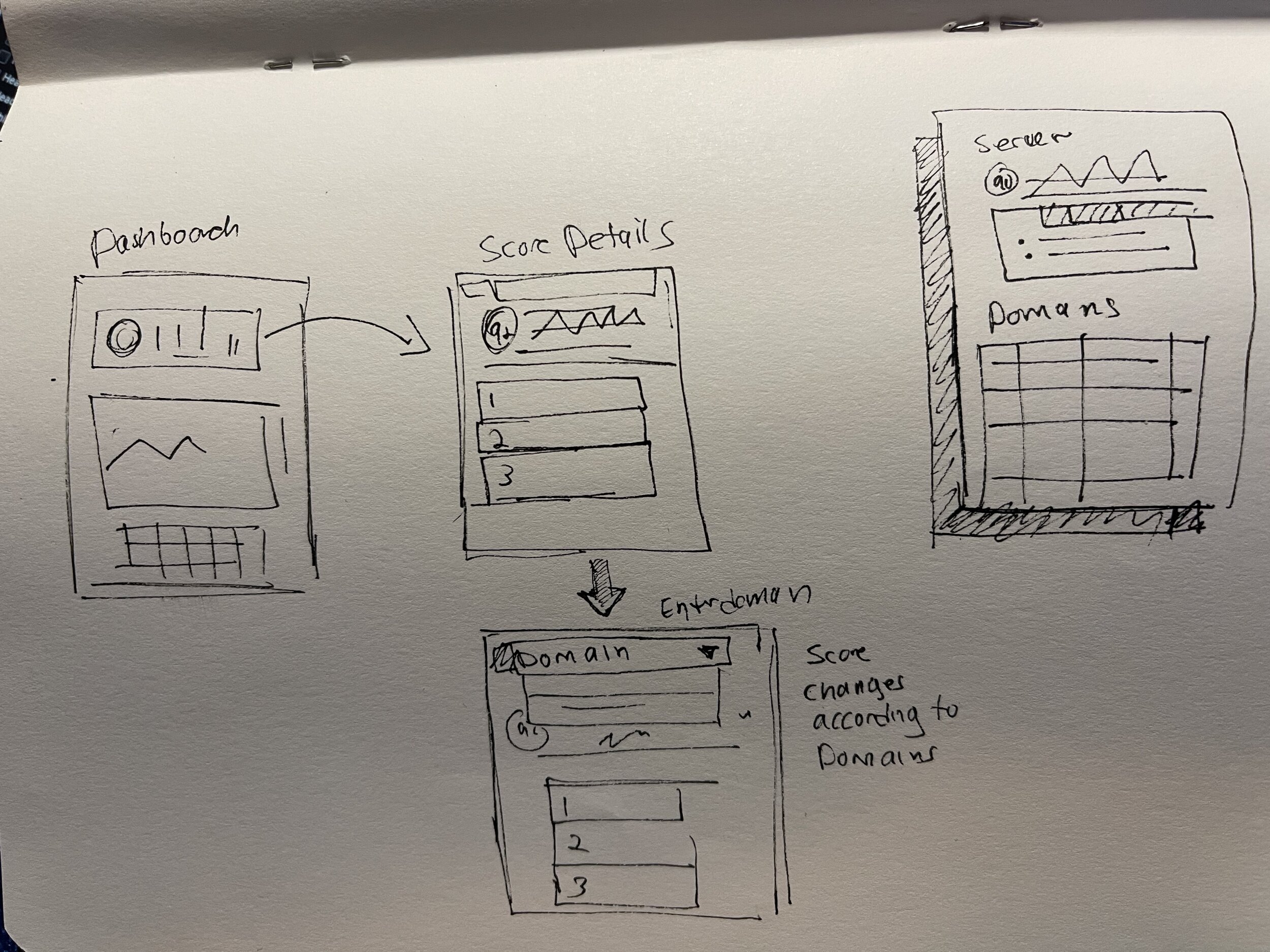
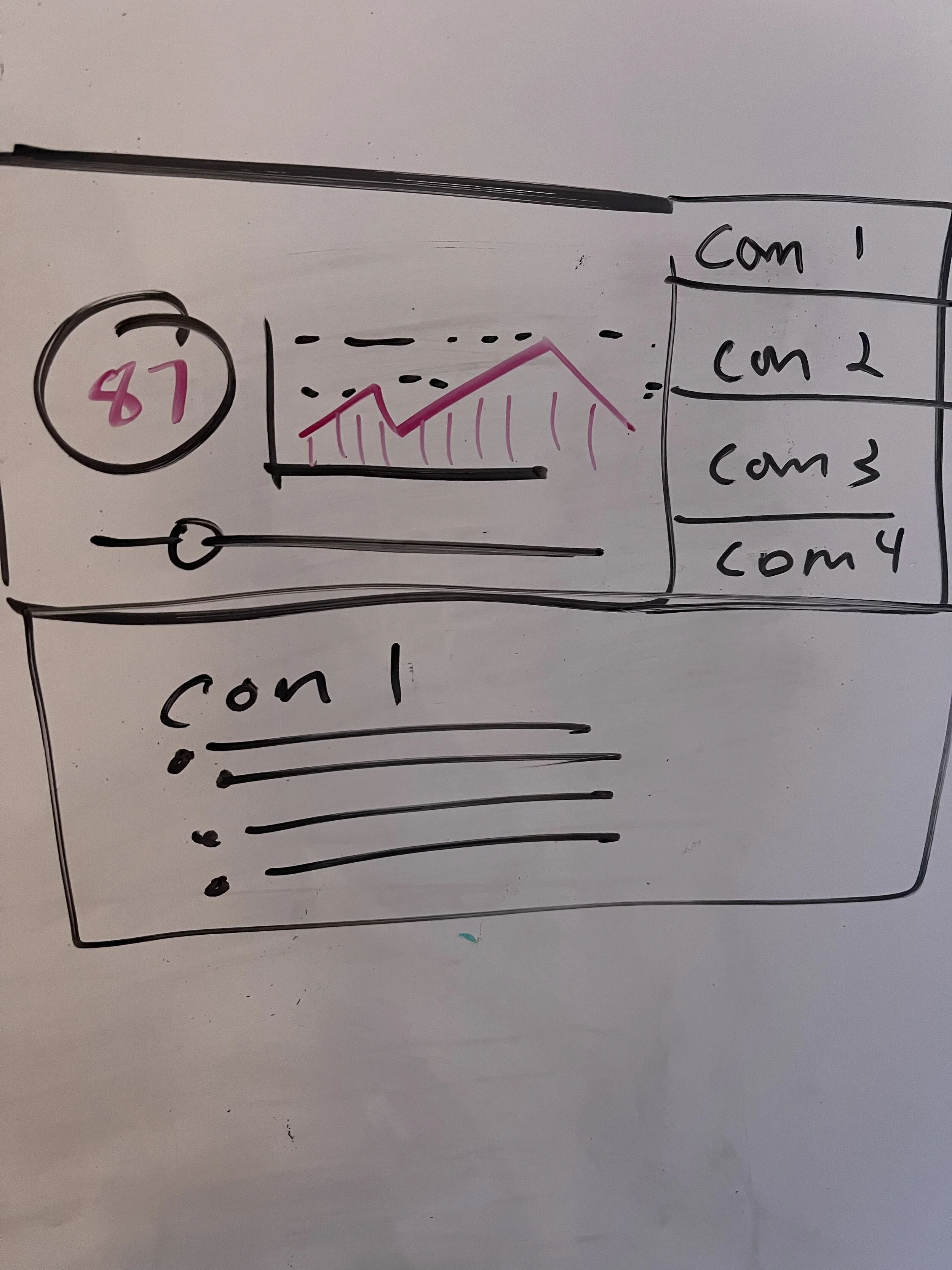
A Sketch of the drill down flow from the dashboard to the expanding components showing what effects the score
The idea is to show the core, the trend, and the components that impact the score
One thing that was left out of the previous iteration was showing the Poor, fair and Good and where they fall in the different colors.
Key behavior Wire Flow
Customers can send emails from multiple sending domains.
so users needed to identify email performance issues at the grand scale first
then allow users to drill down to the finer details to find and resolve email performance issues.
down to the date and time of when the issue happens.
Wireframes
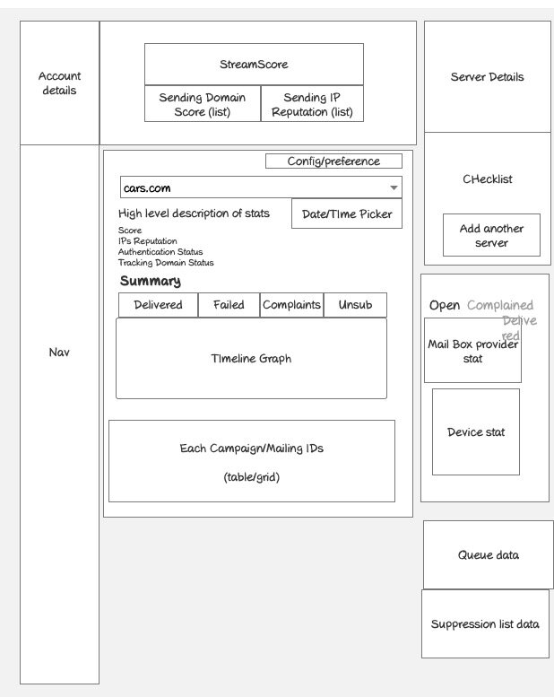
The Dashboard is made up of components that relate to different aspects of email and account status. It acts as a one-stop-shop and provides opportunities to engage.
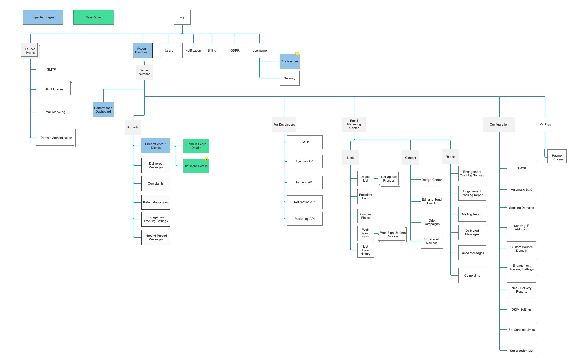
Socketlabs sitemap showing impacted pages (In blue) and new pages to be created (in green)
This sketch is used as a point of discussion surrounding the number of components and their placement on the page
Each server has a score for email delivery, I designed this dashboard for users to scan the performance at the server level and dig down further to see any email performance issues.
Design System/Pattern library
Another part of this initiative was enhancing the visual design. We found a template and tweeked everything to fit in to the brand standards of socketLabs as well as adopt styling into the current patterns.
The Big Picture
I provided a way for users are able to drill down into specific areas such as engagement. and see how opens and clicks impact the email performance.
Applying the visual design I can highilt special aspects of the dshbarod
Account status and Setup, Message stats and the Score.
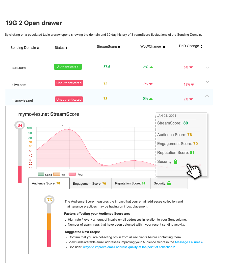
Score trickledown
The overall score of the entire server trickles down to the multiple sending domains. I designed a drawer users can open and view a timeline of outgoing email performance.
Creating the Score
I didn’t just want to design a score but also provide information on how that score is formulated and how to those metrics are impacted..
Behind the scenes in the world of email deliverability Audience, Engagement, reputation, security impacts email reputation with inbox providers such as gmail, yahoo etc..
Overall the dashboard assisted the target audience not only with deliverability issues but also with marketing and engagement.

