First Data DecisionQuest
Decisioning Campaign Creator
First data decided to stop spending money on the training of internal users to use an unintuitive system and instead put the ux team to the task of designing an intuitive application that packages promotional campaigns from other companies (FD Clients) that first Data Will Process, QR Codes, Hyperlinks, Credit Scores, Paragraphs, statement.
These campaigns carry a descisioning (Credit Approval )process and make offers for a target customer matches given criteria.
Guiding Principles:
Wayfinding couldn’t be more important here. The navigation on the left was key. Internal Data Entry users work and teams and needed to find campaigns that other users worked on and bring them to completion.
Information Architecture, internally the teams used very esoteric language and nomenclature so labeling was important.
Key Behaviors that shape the application
Finding campaigns created days or weeks ago.
Naming campaigns
Picking up where others left off in creating campaigns
set up rules to be applied to campaigns
show which rules have been applied to the campaigns for consistency.
Use duplicate rules from another campaign to save time rather than create another from scratch.
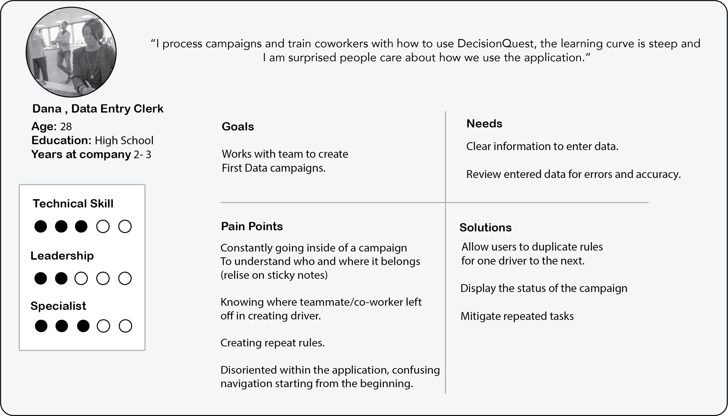
I am designing for Data Entry Clerks that have specific roles, some of them use multiple apps while others specialize in specific apps. The design team and I interviewed the internal Data Entry team that handled the Old Decision Question Application

Capturing The Process
As we spoke to the internal Data Entry team, they walked through the UI as we asked questions about pain points and the overall team process.
I captured the main phases in a journey map
From a UX standpoint, key principles of Placemaking and Resilience of information were an issue.
As users created Campaigns that contains elements inside of elements users would get lost, and the information did not bubble up
this disoriented users on what campaigns to work on, finding out what is inside the campaigns just to get started was a task in itself.
Many of the same rules get applied to multiple campaigns so much of the work was redundant.

How the Puzzle Fits
The language itself was unintuitive, (Credit spreak) but dictated by FirstData business rules and industry standards which put some nomenclature changes out of scope.
I did need to grasp how all the information with a campaign is related and created.
I crafted a concept map to see how the information impacts each other.
Somethings internally bubble up to information above it. Rules impact criteria and segments impact the available rules.
I mapped out the current user flow of campaigns are created right down to the offer.
Understanding all the components that make up the process enabled me to StoryMap the steps from the user perspective.
Mapping all the steps out allows me to look at the entire process while adding ideas to solve usability issues under each step. Some of these design ideas will be essential some of them are nice to have depending on the technical feasibility of the design ideas. I worked with a JavaScript Guru that could help estimate how long some of these ideas would take.
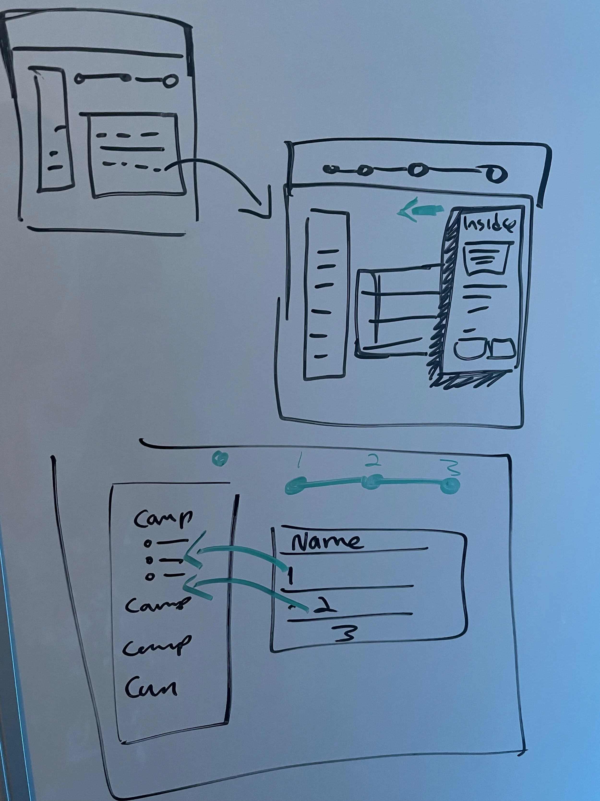
Intandem with story mapping I sketch out the and patterns and ideas, this helps to get the team on the same page.
Allow users to open a drawer showing what is inside of past campaigns. as well as a table giving a brief summary of what’s inside.
Also in creating a campaign invite users to put elements
within elements while showing the progress of the overall campaign. keeping the user-oriented.

I wire-flowed a pattern to communicate the prime interactions
that include searching for elements on the left and applying them to the right, and all editing takes place on the created area.
Keeping this pattern consistant is important because the overall process demands putting elements within elements.

More often than not users are creating elements from other campaigns, so the ability to search filter past campaigns to duplicate elements was a no brainer.

I provide options for the users when starting their campaigns so not to waist time creating new properties when they can use old ones.

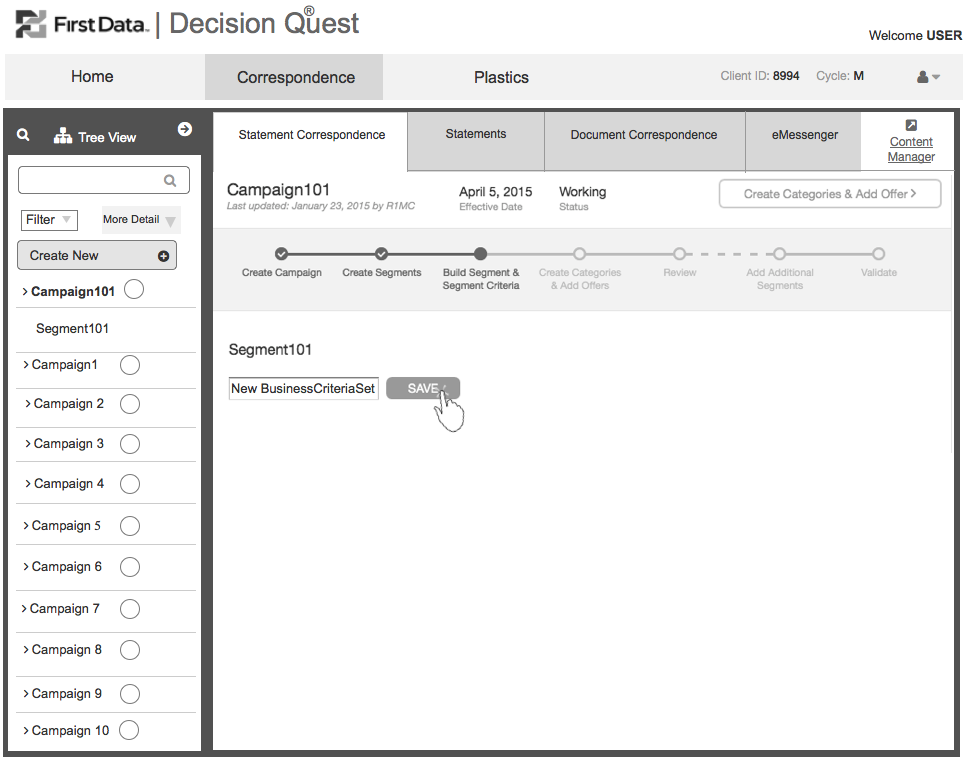
As user add more elements the status up top begins to progress keeping the users on track and oriented.

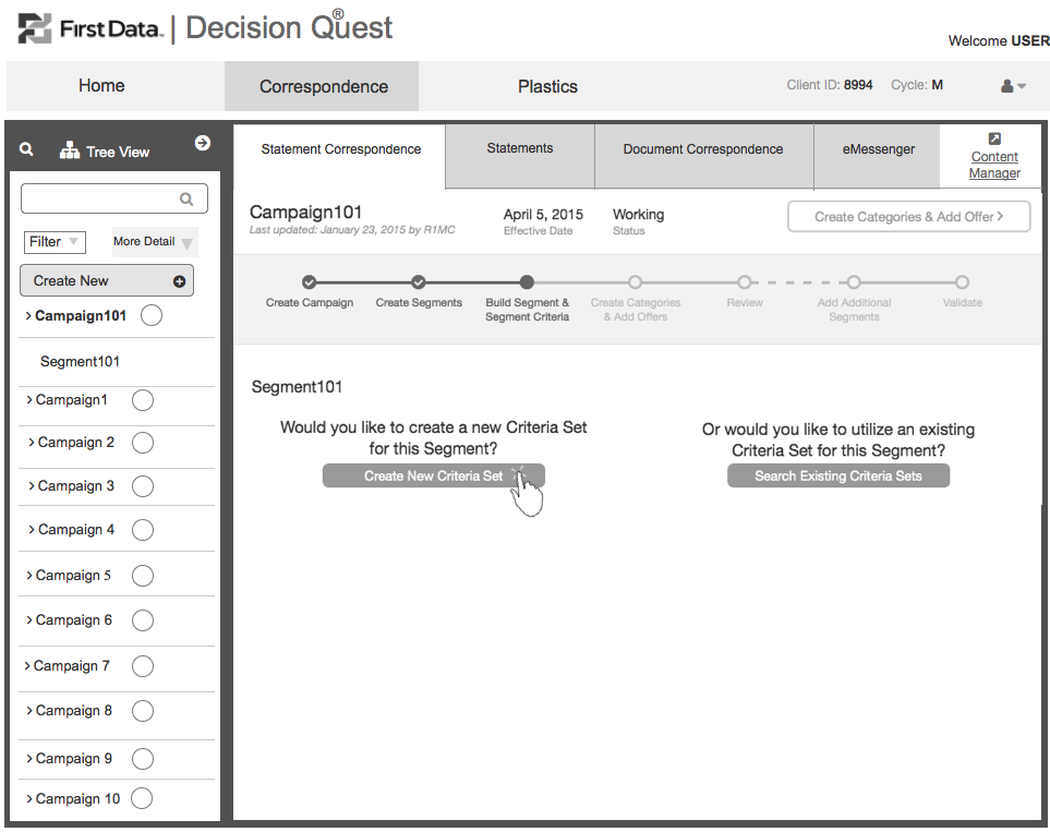
More in more the user progresses, handing different elements within the campaign, here we show how a criteria is created, which is inside of a segment.

When the criteria is saved, the table reveals the necessary information for the user to review. ( previously users had to dig to find out the information about the segment)

Pay close attention to the left Nav Tree View, and how it grows, this is key in how users can see elements within elements and make judgment calls from the top view, and open that campaign and see the progress without having to dig too deep risking getting lost.


Starting form the left we allow invite users to start the process of
